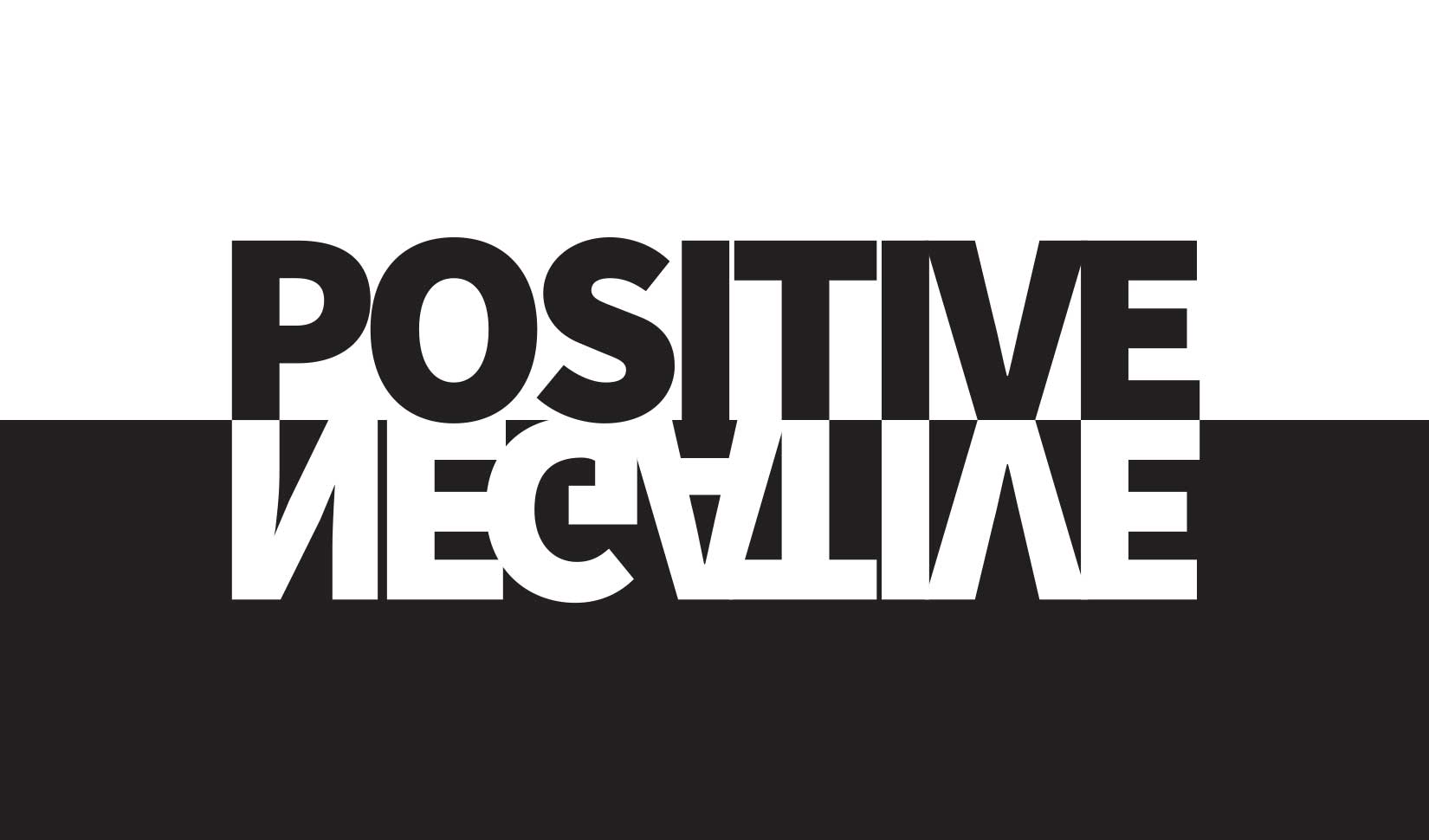
In logo design, negative space is the space that exists between shapes. It actually carries as much weight as the logo shapes without actually having any weight. In a one-color black logo, the graphic is typically depicted in black and the space around it would be left blank, leaving it white. This white space is the negative space and it gives the eye a rest and balances out the darker shapes, increasing the appeal of a design.
Negative space effectively creates a silhouette of the graphic shapes. The amount of space between the shapes, what it looks like, how it balances with the shapes, and the overall design takes a refined eye for design and is often overlooked by many. These subtleties are what help separate a good logo from one that is not all that.
Many of the world’s best logos rely on carefully balanced negative space. Some even take the negative space to another level and use it as if it were a shape. This can give the logo another layer of discoverability to the viewer.
Enhancing Brand Identity
Negative space logos are not just about aesthetics; they are a powerful tool for enhancing brand identity. By creatively using negative space, brands can convey innovation and a unique perspective. This distinctive approach not only sets a brand apart but also highlights its ability to think outside the box, appealing to consumers who value originality.
Boosting Consumer Engagement
A well-designed logo with negative space can engage consumers in a playful and thoughtful way. When logos incorporate hidden messages or images, they invite consumers to look closer, creating a memorable experience. This engagement is crucial for brand recall, making logos that use negative space more likely to stick in the minds of consumers.
Simplicity and Sophistication
Simplicity is key in logo design, and negative space allows for a clean and uncluttered look. This minimalist approach prevents the design from becoming overcrowded, ensuring that the brand’s message is communicated clearly and effectively. By using existing elements creatively, brands can achieve a sophisticated design without overcomplicating it.
Creating Optical Illusions
The strategic use of negative space can also lead to optical illusions, where the interplay between positive and negative space creates unexpected visual tricks. These clever designs not only capture attention but also make the logo—and by extension, the brand—more intriguing, fostering a deeper connection with the audience.
Incorporating these elements into a logo design can significantly enhance both brand identity and consumer engagement, transforming a simple design into an unforgettable brand symbol.
World Class Logo Design
![]()
A familiar example of negative space in logo design is the FedEx logo. At face value, it’s just five letters spelling out the company’s name. But the balance of letter weight, the tight letter spacing that actually makes letters overlap slightly and the way they are drawn in height and shape yields even more when looked at beyond face value. FedEx is company that moves packages from one place to another. The symbol of an arrow can represent what they do in simplest form. It’s why there’s a forward pointing arrow nestled in the negative space between the ‘E’ and the ‘x’. This is no accident, but actually the well thought-out design of Landor Associates, one of the world’s top branding firms.
If you never see that negative space arrow, it doesn’t reduce the impact of the logo’s communication. However, once you see the arrow, you cannot un-see it and definitely won’t forget it.
A Logo Design That is Standing the Test of Time
![]()
Another example of a logo that includes messaging in its negative space is the logo for Public Interest Investigations. This logo, which is now over 20 years old, still stands the test of time thanks to its simplicity and refined, balanced shapes. PII is the go-to source of law firms, corporations, and governmental entities seeking to uncover and understand the truth. The positive shapes of the logo can be looked at as a stylized person finding the truth with a rejoicing arm – or if looking at the negative space, the firm’s initial ‘P’ can be found. Whether you look at the positive space or the negative space, the logo does twice the work sending its messages.
A Logo Designed With a Plan
![]()
Negative space can create something that’s not really there. Your mind literally fills in the blanks because of the shapes around and near it. Zawalski Construction came to Gath Design to design its new logo. When in the discovery phase, one idea stood out from the rest. It was that they take ideas and blueprints that are flat or two dimensional, and make them a reality in the third dimension. That simple idea is what inspired the design of their logo. It was with that concept that flat geometric shapes were used and designed to create something that becomes three-dimensional. What resulted are three simple shapes, perfectly nested near each other to create the company’s initial ‘Z’ in the negative space as if you were looking at it in 3D.
Rebranding with a Conceptual Logo Design
![]()
The last example of negative space creating a secondary design element is that of Long Beach Lakewood Orthopedic Institute. With their branching out to a second location in Long Beach, LBL Ortho commissioned Gath Design to help rename and rebrand their orthopedic institute as a modern, forward-thinking medical institute. When designing their logo, the inspiration behind it was tied to their philosophy that they continuously strive for growth/healing and motion with all their patients. The three rotating leaves reinforce that philosophy, while the negative space in the middle carves out a perfectly-balanced ‘L’ representing the two cities they now serve, Long Beach and Lakewood.