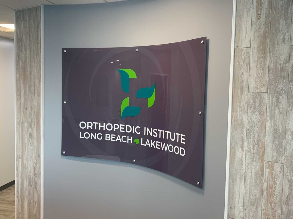
Long Beach Lakewood Orthopedic Institute
IDENTITY DESIGN
Inspired by the Tree of Andry, a well-known symbol in orthopedics, motion, and growth, the Long Beach Lakewood Orthopedic Institute logo utilizes negative space to present its initial “L.” The branding is used on everything from printed materials, the internet, and in environmental graphics and signage.
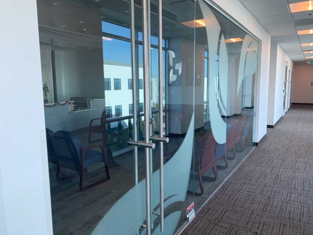
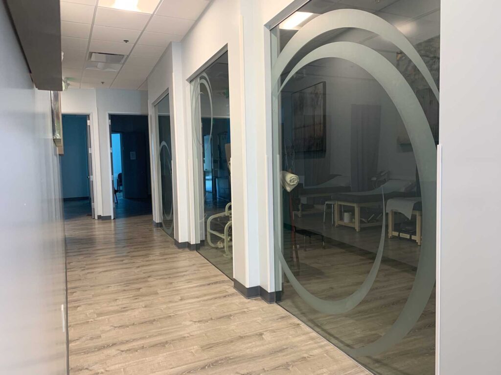
ENVIRONMENTAL GRAPHICS & SIGN DESIGN
Long Beach Lakewood Orthopedic Institute’s new Long Beach location leveraged its new branding in the signage and window graphics inside and outside of the office. The new graphics weave the branding throughout a patient’s experience from the time they enter the front door through each step of their treatment.